
Why it is important to segment your data and
how to do it in R
Now days all organizations have to deal with tons of data produced each day by all the areas involved in the whole company. This represent a huge challenge for each organization regarding the way that this information is managed and how the insights taken from these assets have an impact on the creation of the business strategy. Given the important quantity of bytes handled internally in the different teams along organizations, it is fundamental to try to make it simple as possible, otherwise this could lead to chaos, frustration and therefore loss of competitiveness.
The best way to make it simple is through the segmentation or separation of the information based on common qualitative features. For instance, if we have a data set that contains the purchase record of several customers and their basic information such as country, gender, age, profession etc. we could organize the purchase data by country and profession in order to be able to create segmented strategy that leads us to get a more efficient performance, through the improvement of the understanding of the customers.
In this exercise one data set of more than 500.000 rows has been downloaded from Kaggle. It contains several variables that are: Invoice number, stock code, description, quantity, invoice date, unit price, customer ID and country. First of all, is it important to add a calculated column. Given that the data set has the unit price of each item and its quantity, we can add the calculated column through a simple multiplication.![]()
With this simple code we are able to create the calculate column that basically as it has been explained previously, is just the multiplication of the column number 4 (Quantity) times the column number 6(Unit price).
After the calculated column has been created, now we have to proceed to explore our data. For this process we can use 3 fundamental functions that are:

Dim function helps us to get a summary of the matrix that we are using as a dataset. This function will give us the number of rows and columns. In this case we are using a dataset of 541.909 rows and 9 columns.
Head function gives us the first 6 rows in the dataset
Summary function helps us to get a statistical broad summary. In this case I have used the Income variable. The function will show us the minimum and maximum value, the 1st and 3rd quartile and the median and mean.
![]()
After the data exploration, it is necessary to organize the data in groups based on specific features of the dataset.
![]()
In this case the data was grouped based on the countries and is going to be summarized into three different variables that are:
- Tot: This variable is the sum of all the invoice values in order to get the total monetary amount per country
- INC: This variable basically is the average value of the invoices
- Number: This variable just gives us the total amount of invoices registered in our dataset.
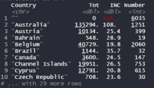
With this exercise, was possible to group the data into the different countries registered in the dataset. Given technical issues the code does not show all the countries. If we want to see all the 39 countries with their data, would be necessary to create a new dataset and apply the view function in order to get it.
![]()
For example, if we create the dataset that is called Test123 and after that we use the function “View” is going to be possible to see the data of the 39 countries in a different table.
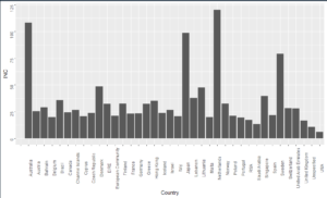
No R project can finish without a graph. So, for this we can use the ggplot2 library.
![]()
With this code it is possible to get a bar chart that show us all the countries and their average invoice amount
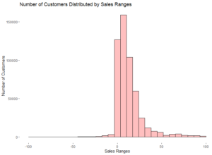
Also, it is possible to create a histogram in order to see the distribution of the data among some determined ranges. To get that kind of chart we can use the following code:
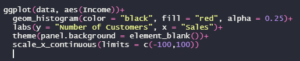
It is important to notice that the scale_x_continuous
function has been used because our data has some outliers far beyond the mean.
This function helps us to shrink the range in the x axis, otherwise our chart
would not be clear enough and therefore the distribution among the ranges would
not be possible to detail.
With all this data gathered, analyzed and segmented, now it is possible to design a commercial strategy based on